Edit 1
Trailer- Guilty
This is our first edit of the teaser trailer we have created. We used three soundtracks as we felt as though these three were the main ones that suited our film and also because they created more suspense within our range of shots. There is also dialogue and a sound-bridge used to give a clearer view of the plot and its aim for the characters.
What Went Well:
The flow of the trailer has been done well along with some of the suspense which has fitted a thriller teaser trailer. We were able to complete a final version as our first edit and also not give too much away as it is only just a trailer
Even Better If:
As our chosen soundtrack was not suitable we did have to find a replacement to make it more believable and to also find a way to shorten the trailer. I believe if we used the time we had from the beginning more efficiently we would have been able to make changes earlier and make the trailer a little more better.
Trailer- Betrayal
Within our final edit of the trailer we decided to change the beginning of the trailer whereby the shots are in black and white and they only talk about the plan of murdering the boy. We felt that the black and white was to emphasise that it was said in the past.
What Went Well:
We were able to get a final edit complete before the deadline and also the trailer now felt like it was no longer giving too much away which is typical of the conventions and functions of a trailer as it is only meant to tease and excite the audience.
Even Better If:
I do believe that if we had a longer time frame we could have filmed a few shots again to add more suspense and tension towards the trailer to make it more thriller.
Edit 1
Magazine Cover
We decided to use the empire magazine as part of our thriller teaser trailer. This is because the empire magazine and the colour mainly use for its main title was the main theme we were going for, which is red. I also believe that the empire magazine can be challenging to make.
What Went Well:
As a group we were able to use the background and the original images we had taken to blend and make the image look neutral. We were also able to complete nearly the whole magazine cover and ensure that there were consistency within the colours without the theme looking too odd.
Even Better If:
I believe that to make this film poster better we should have added more pugs and cover lines so that we could have a final piece to look back and edit on completely. Also this magazine was time consuming however, the time we spent allowed us to work to the best of our ability.
Final Edit
Magazine Cover
In this magazine cover we decided to use the red stroke around the title because it added to the thrill and the suspense. As you can see we didn't change the magazine cover extremely, we only chose to change the title and also rearrange the head lines to make it look like the typical empire poster.
What Went Well:
We were able to create a product that looks realistic and also ensure that it looks thriller. We used coverlines that can also be related to our thriller trailer and the genre therefore they interlinked.
Even Better If:
I do believe that it could have been improved with the font style around the coverlines to make it seem more eye catching.
Edit 1
Film Poster
In this poster we have used the grey and black tone of colours to represent a sinister tone. We also added our title which we have decided to put as 'Not Guilty.' The reason for this title is to categorise the girls and create the enigma of who is under this murder. The fact that they all do claim to be 'Not Guilty' builds up suspense because if it weren't them behind this then who was?
What Went Well:
Within this poster I believe that out colours were consistent and also the positioning of the faces already makes them look mysterious.
Even Better If:
We didn't get to finish the final poster therefore to me personally I still think that the poster looks a little vague.
Final Edit
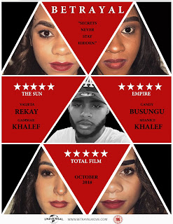
Film Poster
As you can see from our final edit we have changed the film poster entirely as we believed that the previous poster did not connote thriller. There for just like our magazine cover we used the colours red, black and white but also changed the colour of our male character to black and white as we believed that it represents the fact that he was the victim and murdered in cold blood therefore it makes him seem more innocent and vulnerable compared to the rest of the characters in the film poster.
What Went Well:
Within our final edit I do believe that our colours are more consistent and the sense of thriller is conveyed through the extreme close ups of the eyes in each of the the triangles.
Even Better If:
Although I am satisfied with the final product I do believe our film poster needs a billing block


No comments:
Post a Comment