
During task 1 I created a 1950’s poster using adobe Photoshop pro. Before A-levels I had already done media for GCSE however, I had only used paint shop pro instead of Photoshop therefore I only had basic knowledge when it came to editing photos. From this task I learnt how to use the tools such as the magic wand, lasoo tool and the selection tool in order to cut out a single image to make the poster look realistic. To ensure that everything looked neat I also used the eraser tool to smoother out the edges. In this task I also learnt how to rotate an image and how to get an image on to my chosen background.
Task 2
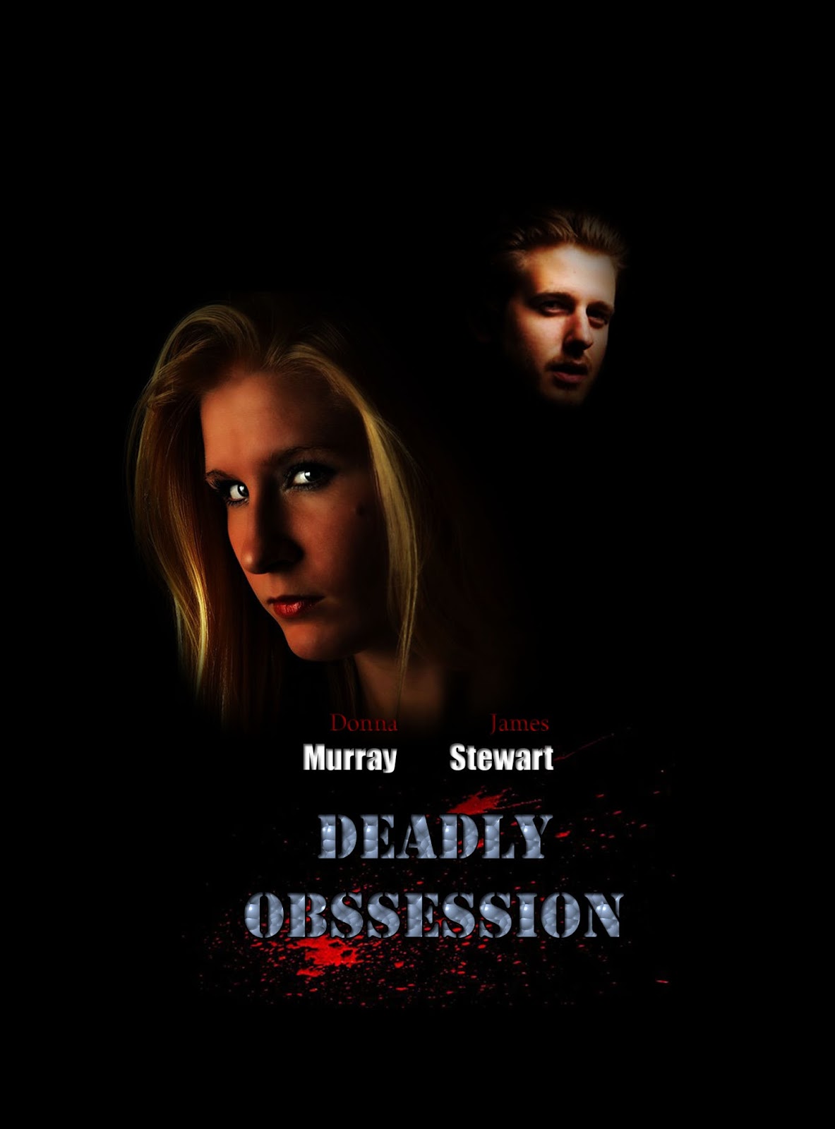
For task 2, I then had to create the deadly obsession poster. This poster included me having to make my own background and also how to resize it to the correct size as the file maybe too big and also if it’s not given the correct resolution it maybe blurry later on. After this I cut out the two images and used the eraser to blend the images to the background to make it seem like they’re just about fading in to the background. For the man as his original image was pale I changed the image colour and added contrast to make him seem more tanned and blended in to the black background. I also had to add the splattered blood and make sure it blends with the text that I had added. With this I also learnt how to add strokes and effects towards the text to make it look more appealing.
Task 3

For task 3, I created the safe house poster using three different images into one background. With this I created a normal background to the right resolution and size. I then placed each image on top of the background. Once I done this I learnt how to create a new layer in order to create a banner. I done this by using the selection tool creating a rectangular shape from one end of the image to the other. I then used the gradient tool to create that effect where it goes from the dark colour to the red that I had wanted. This created an effect and made the poster look like it was in scenes which also emphasised the starring characters in the film.
Task 4

Task 4 was about making our own film poster. I chose The Stepfather where I used all the knowledge I had obtained from my previous task of to make my own poster which was original. With this I learnt how use different images to create an effect, rather it looking scattered I planned how I wanted my poster to look first on an A4 sheet of paper to see what ones best. I didn’t exactly use my plan however my plan helped me create this image. I learnt how to create my own background again and how to use space to fill up the whole area of the background to make it look worth looking at and going to see. I included the picture of the stepfather as a part of revealing the star and the main character of the film.
Task 5

In Task 5, I had to create my own film magazine poster using all the knowledge I had gained from creating the film posters I had made. In order to create this film magazine poster, I had made a plain background with the correct resolution and size to avoid any blur. Then I had cropped this image and pasted it on to the background and resized it to the correct image. As the Sight and Sound caption would have covered Wonder Woman's face I decided to copy the image of her face by using the lasoo tool first to crop her face and then I pasted her face on top of the image. This was my first time doing this therefore it was a new technique I had learnt. With this I believe that it expanded my knowledge on how to use Photoshop pro and how to make the poster itself look well organised and realistic. Creating this film magazine was different for me because I had to start from scratch however it was not that hard to make as I had enough practice from my previous tasks.
Task 6

Task 6 was about creating a duo image of the Skyfall magazine poster. This magazine poster involved a lot of shape making and colour filling using the gradient tool. This improved my knowledge on how to create colours and shapes within a magazine poster and also to make it look more appealing to an audience. The total film magazine logo was already on the shared area so in order to get it on I used the lasoo tool and also inverted the colours to the original format. This developed my skills and confidence within as I now know how to use to use the tools to create an image.
Task 7

In task 7 I created the Suicide Squad poster using one of the main characters Harley Quinn. To begin with it was hard as I was trying to limit the colours I was using but also because I wanted the image to realistic. Within this poster I was able to create puns and also add an effect within the format on 'Suicide Squad' which makes it stand out more and look more appealing as the whole poster consisted of the colours black, purple and white.
No comments:
Post a Comment